Peach
Hex Code, Palettes & Meaning
Peach (#FFD3AC) embodies warmth, comfort, and approachability—making it a standout choice in modern design. This gentle blend of orange and yellow tones with a hint of rose creates a versatile color that bridges youthful energy with timeless sophistication.
As Pantone's 2024 Color of the Year (Peach Fuzz), this hue reflects our collective need for nurturing and human connection. In UI/UX design, peach works exceptionally well as a subtle accent color that guides users without overwhelming them—perfect for call-to-action buttons, backgrounds, or highlighting key features.
Peach pairs beautifully with complementary colors like soft blues or mint green, creating balanced, eye-friendly color schemes. For warmer palettes, combine it with apricot, cream, or light pink for a cohesive, inviting atmosphere.
Psychologically, peach promotes feelings of care, renewal, and optimism—making it ideal for brands focused on wellness, hospitality, or community. Unlike bolder colors that demand attention, peach works on a subliminal level, creating welcoming spaces that encourage engagement and trust.
Whether you're designing interfaces, creating brand palettes, or planning interior spaces, peach offers the perfect balance of warmth and professionalism that resonates with contemporary audiences seeking comfort in an increasingly digital world.
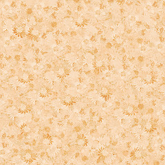
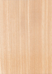
Images with Peach color


Color Palettes
Complementary
Split
Monochromatic
Analogous
Triadic
Hex
#FFD3AC
RGB
255,211,172
HSB
28, 33%, 100%
HSL
28, 100%, 84%
Other Colors
Champagne
Explore the qualities of Champagne.
Learn more
Dark green
Explore the qualities of Dark green.
Learn more
Coral pink
Explore the qualities of Coral pink.
Learn more
Byzantium
Explore the qualities of Byzantium.
Learn more
Red violet
Explore the qualities of Red violet.
Learn more
Slate blue
Explore the qualities of Slate blue.
Learn more