Off-white
Hex Code, Palettes & Meaning
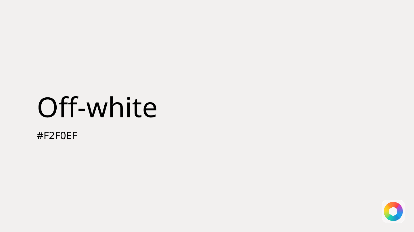
Off-white (#F2F0EF) strikes the perfect balance between the crispness of pure white and the warmth of neutral tones. This sophisticated shade offers RGB values of 242, 240, 239, creating a subtle, soft appearance that feels more inviting than stark white while maintaining elegance and refinement.
Psychologically, off-white evokes comfort, delicacy, and clarity without the sterile feeling of pure white. It's particularly valuable in UI design where readability matters—providing an ideal backdrop for text-heavy interfaces while reducing eye strain. The color's understated nature makes it excellent for highlighting important content, creating negative space, and serving as a foundation that lets bolder accent colors shine.
Off-white pairs beautifully with both warm and cool tones. Try combining it with navy blue for nautical sophistication, sage for natural harmony, or cognac for rich, earthy elegance. Its versatility makes it a go-to choice for premium branding, minimalist designs, and spaces requiring a sense of calm professionalism.
Unlike pure white, off-white feels approachable and human—perfect for creating designs that are polished yet welcoming, sophisticated yet comfortable.
Images with Off-white color


Color Palettes
Complementary
Split
Monochromatic
Analogous
Triadic
Hex
#F2F0EF
RGB
242,240,239
HSB
20, 1%, 95%
HSL
20, 10%, 94%
Other Colors
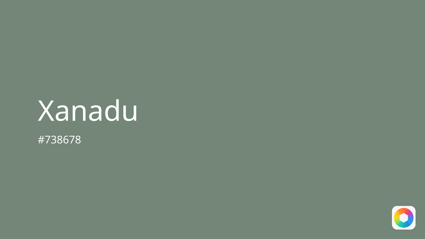
Xanadu
Explore the qualities of Xanadu.
Learn more
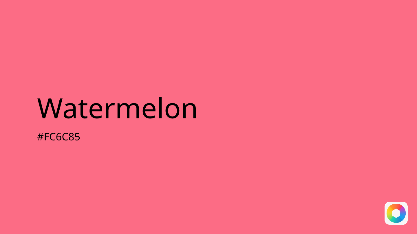
Watermelon
Explore the qualities of Watermelon.
Learn more
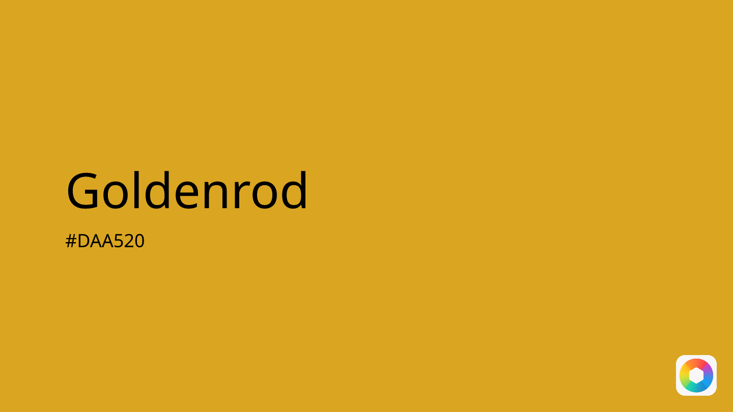
Goldenrod
Explore the qualities of Goldenrod.
Learn more
Dark purple
Explore the qualities of Dark purple.
Learn more
Peach
Explore the qualities of Peach.
Learn more
Emerald green
Explore the qualities of Emerald green.
Learn more